ZARA is a popular fast fashion retailer for young adults worldwide. ZARA is a relatively affordable shopping retailer however in their stores and online and on their mobile apps, they give their customers a sophisticated and edgy shopping experience. While their efforts are appreciated in stores, it has seemed that they have chosen aesthetic over functionality in their website and mobile app. In this case study, I’ll be discussing how we can improve the shopping experience of customers using the ZARA app.
Identifying the Users and thier Goals:
The primary users of the ZARA app consists of the young adults with slightly more women than men.
Some of the goals of the users of the ZARA mobile app are to:
-Shop for clothing items
-Easily find what they are shopping for
-Order clothing
-Receive discounts for shopping on the mobile app
-“Favorite” or save clothing items for a future order
-Log into their ZARA account
-Chat with a ZARA support personnel
App Analysis:
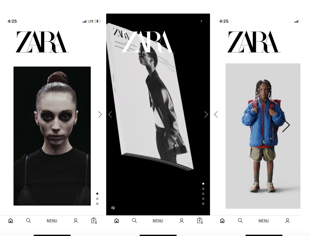
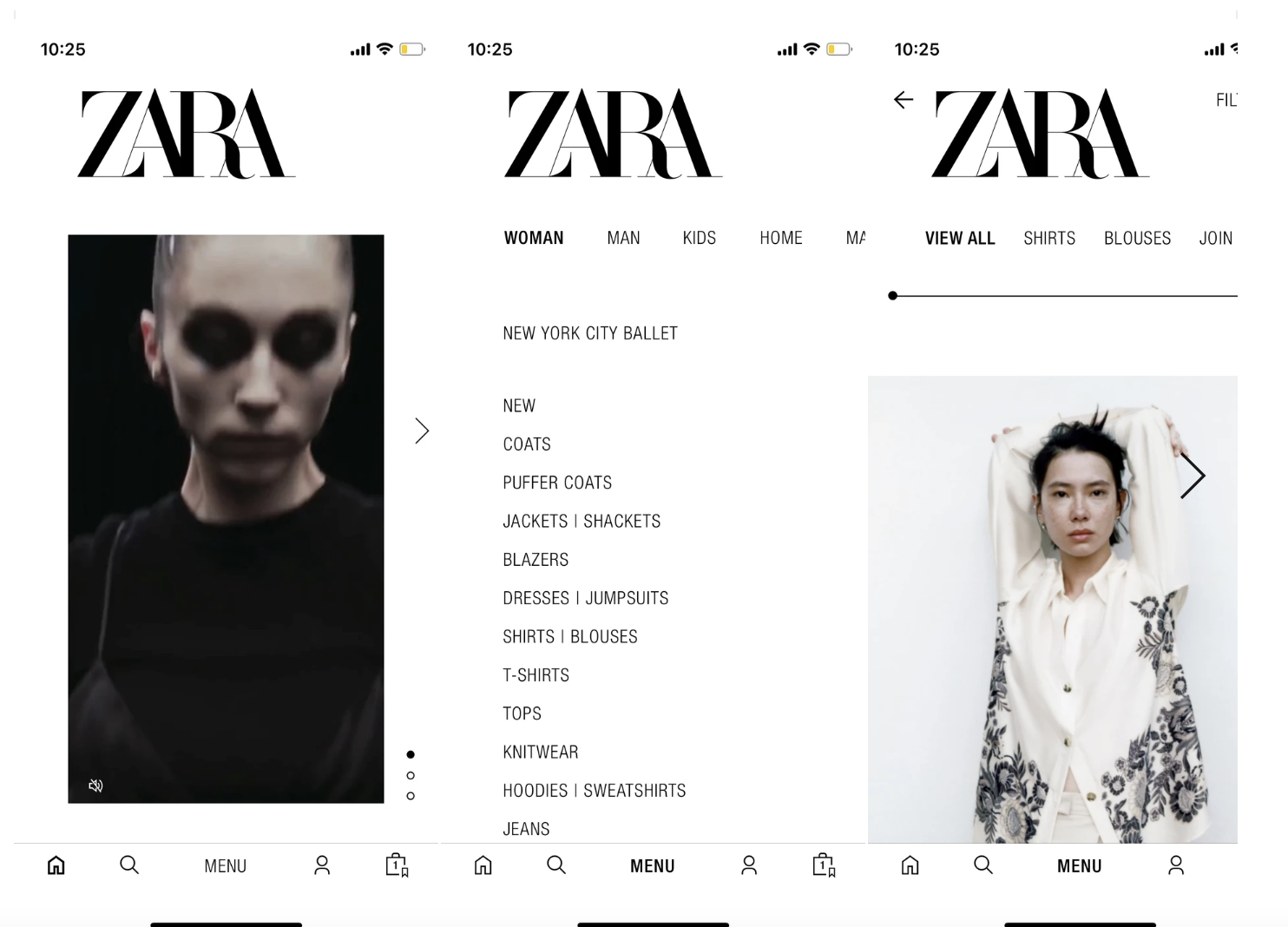
Due to the global pandemic, mobile and online shopping have become almost essential to customers. While most shopping apps are somewhat intuitive, ZARA’s mobile app is quite tricky to get the hang of. The overall aesthetic of the app is minimalistic and beautiful with lots of stunning and eye-catching photographs and not many words or symbols. One downfall is that the aesthetic can confuse users on the purpose of the app. Though most users of the mobile app are already loyal customers of ZARA, I feel like if you were not familiar with the brand, you would be very confused what kind of store ZARA is. The following images show images from the home screen slide carousel.
Additionally, the app was hard to navigate with both horizontal and vertical slide carousels on the homescreen as customers are faced with a choice which way to go. Nevertheless, finding the clothing was somewhat difficult and took longer than expected, something that can drive consumers to give up on their intended task.
User Research:
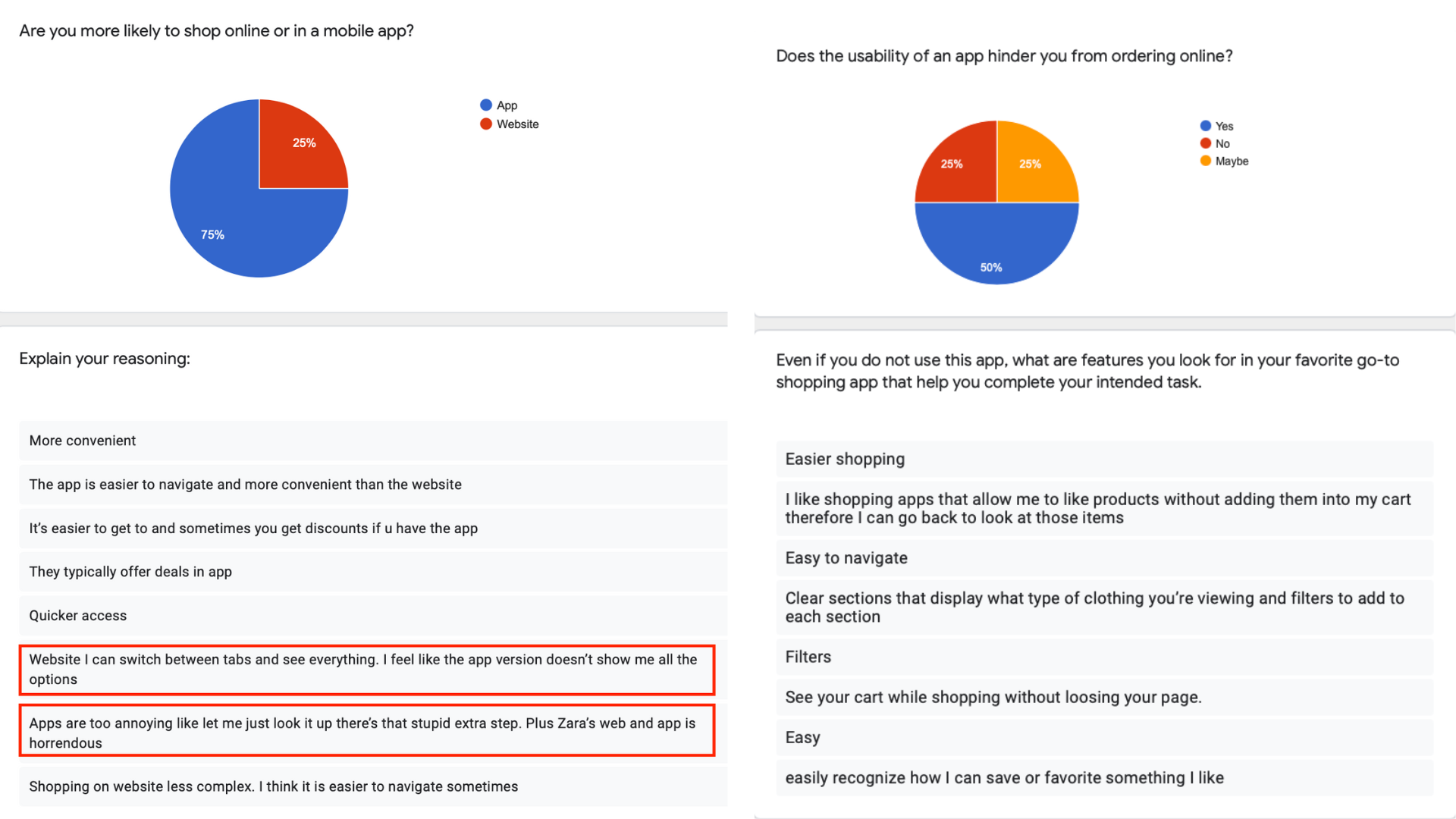
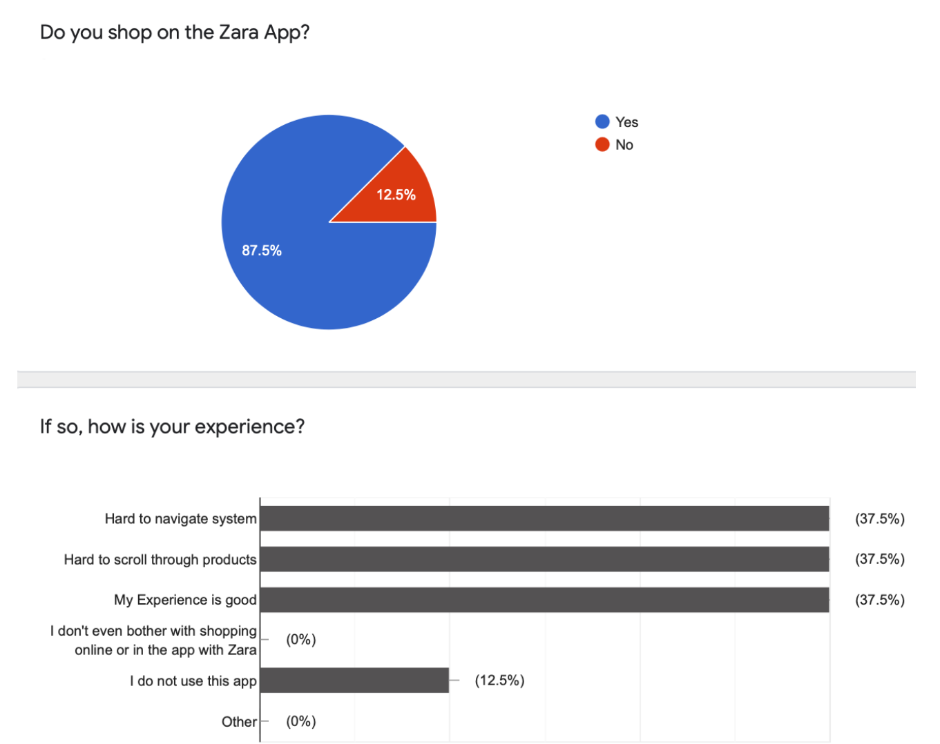
My user research included 8 James Madison University female students in their early 20’s. I sent out a survey and this survey had questions to determine the user's experience with the app.
According to the results, I came to understand that the majority like to shop on the mobile app for convenience and while most shop on the ZARA app, their experience is majorly poor.
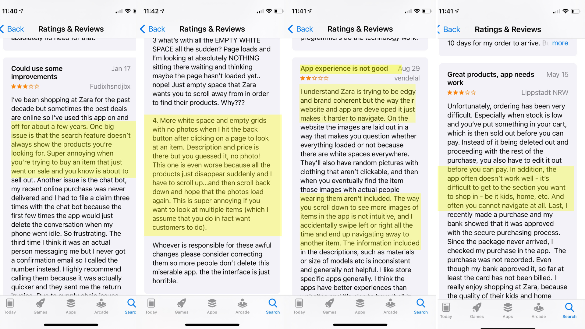
To further understand more frustrations, I went to the App Store and found reviews of the app.
Design Problem Statment:
After examining all the user research, I was able to formulate two pain points of the Zara mobile app.
-Pain Point #1: The ZARA mobile app is hard to navigate due to aesthetics. (Too much white space, pages not standardized, too many options, etc. )
-Pain Point #2: The ZARA mobile app is hard to navigate due to scrolling features.
Design Question: How might we improve the experience of individuals trying to shop for clothes in the ZARA app?
The Redesign:
From the user research, I conducted that the process to get from the homepage to the page that displays the clothing needs to be simpler.
The Design Solution:
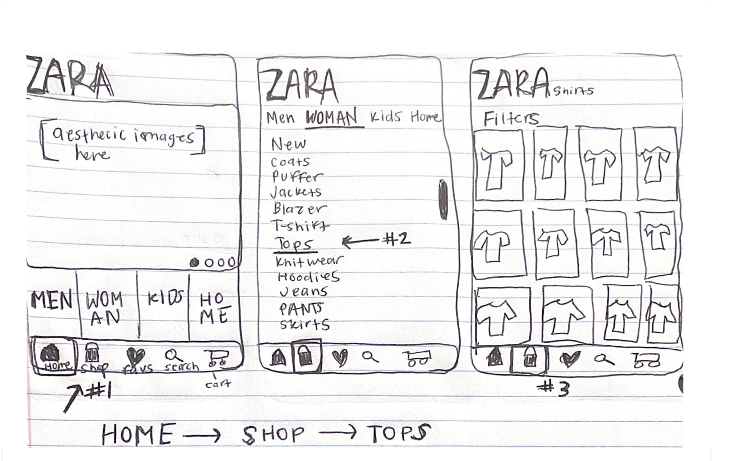
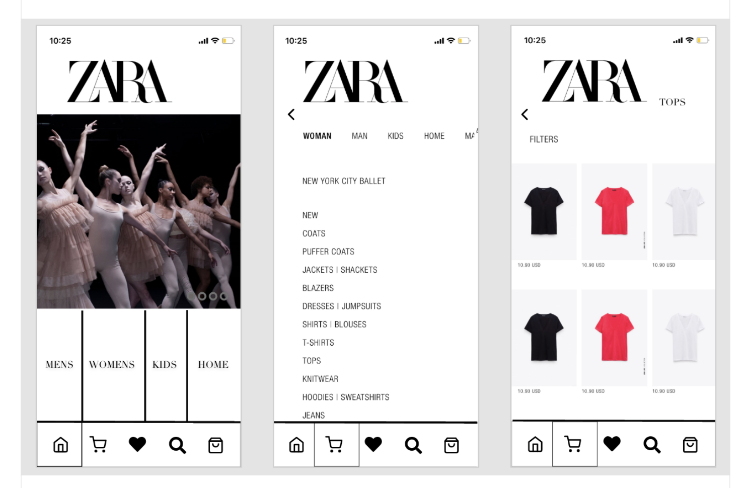
In order to solve this issues, I think that the homepage should be more functional than aesthetically pleasing. I think this can be done by reducing the size of the images on the Home Screen and enlarging the navigation menu at the bottom. I would also keep the home screen to just horizontal scrolling features.
From the navigation menu, I would immediately pull up a menu of the different shopping options.
Then on the different site pages, I would keep all the images the same size and for them to have the same look. I would reduce the amount of unnecessary white space and have all the products in even grid lines.
Before:
Wireframes:
After:
Rationale:
I think through these minor changes and simplification, users will have a better experience shopping on the ZARA mobile app.
In consideration with Hick's Law, now that the user will have less choices, they will complete their intended task quicker. By changing the homepage, I think the user will be able to scroll through the content and pick what they are shopping for in a reasonable amount of time.
I think by making the navigation menu larger and by adding another menu with "Men, Woman, Kids, Home", users will have an easier time navigating where they want to go.
Finally, with the products page much more uniform and concise, I think the user will have a better experience searching for their intended product.
This new flow targets both pain points and helps users navigate the app better.
Conclusion:
Sometimes, less is more and I think this proves to be true in ZARA's case. I understand that ZARA wants to have their app unique and different, however, according to my user research, users prefer accessibility over aesthetics. I think this is a great lesson for UX practitioners to learn from when they are ideating and developing apps because sometime you have to remember the power of familiarity and you don't always have to reinvent the wheel.
Hand-coded and designed with love. | Julia Yeager 2023